Live AR Operator Dashboard — Comprehensive Visit Reporting and Performance Management
Project Overview
As a UX Designer, I was responsible for creating the Live AR Operator Dashboard, a desktop application built to support managers and operators overseeing field sales representatives. The dashboard integrates with the AR Display Live application, enabling real-time reporting, performance evaluation, and operational control. The challenge was to design a product that transforms complex data into clear insights while ensuring a seamless, intuitive experience for non-technical users.
Industry
FMCG
Merchandising
Tools
Figma
Jira
Adobe Illustrator
Adobe Photoshop
Protopie
Target
Planning and designing a new system based on old functionalities, improving the performance of current elements and designing new ones.
The Problem
Sales operators struggled with:
Fragmented data sources — reporting was spread across multiple tools.
Limited visibility — managers lacked real-time insights into ongoing field visits.
Inefficient workflows — performance evaluation relied heavily on manual reporting.
Difficulty identifying trends — analyzing KPIs across different teams was time-consuming.
Our goal was to create a unified platform that simplifies reporting, improves transparency, and supports data-driven decision-making.
- Lack of transparency in field sales representatives’ activities,
- Limited ability to respond quickly to irregularities,
- Difficult control of product and POS display,
- Manual and time-consuming visit reporting.
Research & Discovery
To define user needs, I conducted:
Stakeholder interviews with sales managers to understand reporting pain points.
User journey mapping to identify bottlenecks in daily workflows.
Competitive analysis to benchmark existing reporting and dashboard solutions.
Key findings: users required clarity, speed, and control. They wanted immediate access to structured data without sacrificing usability.
Design Approach
I applied a human-centered design process, focusing on:
Information Architecture
Structured the dashboard around three core functions: Reporting, Evaluation, Control.
Designed a logical navigation system with a clear hierarchy for quick access.
Wireframing & Prototyping
Developed low-fidelity wireframes to test content layout and data prioritization.
Iterated with interactive prototypes, gathering feedback on usability and clarity.
Visual Design
Created a clean, professional UI emphasizing readability and data visualization.
Used consistent iconography and color coding to highlight key KPIs and performance trends.
Interaction Design
Integrated real-time updates to support fast decision-making.
Added filtering and sorting controls, enabling managers to customize their views.
The Solution
The final product — Live AR Operator Dashboard — empowers users with:
Real-time reporting — instant access to visit outcomes, meeting details, and client interactions.
Performance evaluation tools — visual KPIs, comparative analytics, and trend tracking.
Operational control — ability to enforce standards, monitor compliance, and quickly detect deviations.
The dashboard transforms raw data into actionable insights, allowing managers to oversee field activities with confidence and precision.
Key Pro Display Features
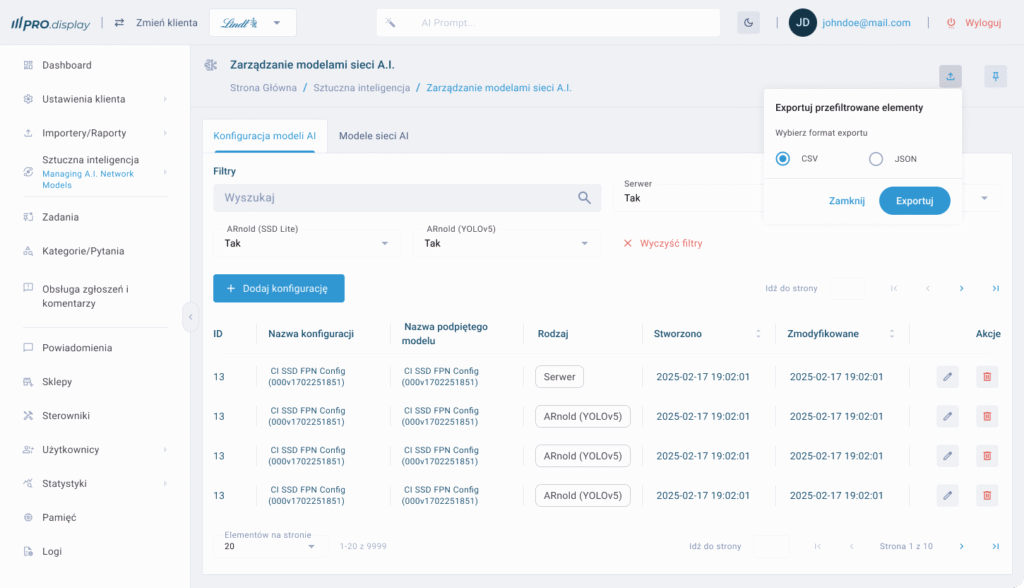
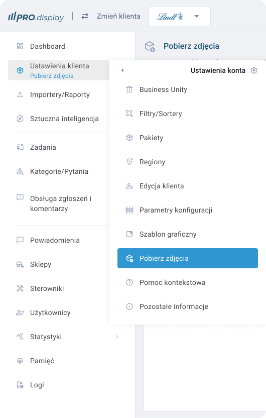
Visit Management
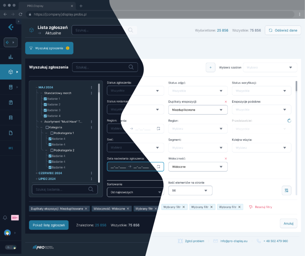
The application interface allows you to track representatives' visit schedules in real time, with the option to filter by region, date, or responsible person.
Visual Display Analysis (AR View Sync)
Thanks to integration with AR Display Live, desktop application users have access to complete visual documentation – photos and 3D models of point-of-sale displays – enabling immediate assessment of the correctness of operations.
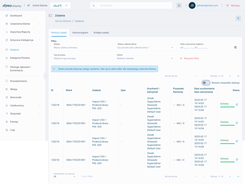
Reporting and Archiving
Each visit is automatically saved in the system as a PDF report or in an interactive version, with the option to export to Excel, significantly streamlining the creation of monthly KPI reports.
Rating and Notification System
Supervisors can assign ratings to individual visits, comment on irregularities, and provide recommendations to representatives in real time.
Data Synchronization and Security
The Pro Display application ensures full data synchronization with the mobile version. Data is encrypted and stored on servers compliant with GDPR standards.
Implementation results
Implementing the Pro Display system has delivered measurable benefits for companies:
+65% increase in transparency and control over salesperson visits,
-40% reduction in the time required to analyze displays thanks to the AR visual verification feature,
+50% improvement in display consistency with marketing guidelines,
Significant improvement in communication between the field department and headquarters.
Opportunities for further development
The current version of the app allows for full operational control, but additional features are planned:
- Introduction of artificial intelligence to automatically recognize display errors based on AR images,
- Integration with CRM and ERP systems to fully automate reporting and invoicing processes,
- Expansion of the online training module and sales representative competency assessment.
Design and UX – A project created with intuitiveness and efficiency in mind
The user interface design of the Pro Display application is based on the principles of functional minimalism, prioritizing clarity, ease of use, and fast performance. Knowing that the main users are sales managers, merchandisers, and operations staff, the interface was created to ensure navigation is intuitive even for users with limited technical experience.
Key Design Principles:
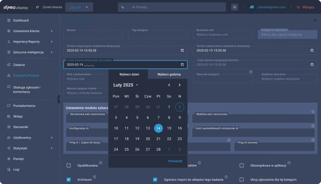
Information Hierarchy
The main dashboard features essential indicators such as the number of completed visits, performance evaluations, activity charts, and notifications about irregularities. This allows users to immediately see where action is required.Modular Interface Architecture
The screen layout was designed in a modular structure, making it easy to expand and add new functionalities without having to rebuild the entire application.Consistent Visual Identity
The application’s color scheme and typography align with the client’s brand identity. Additionally, color coding was implemented to distinguish between completed visits, visits in progress, and those requiring attention — significantly reducing decision-making time.Responsiveness and Scalability
Although primarily intended for desktop use, the application was designed with various screen sizes in mind — including ultrawide monitors often used by operations managers.Collaboration with AR Designers
The interface components responsible for displaying 3D models and AR-enhanced images were designed in close collaboration with the AR team, ensuring a seamless transition between the physical and digital experience.

Testing and optimization
The design process utilized an iterative UX Design methodology – prototypes were first developed in Figma, then usability testing was conducted with target users. Changes were made to the report filter layout, the visit detail view, and system notifications, among other things.
The result of this process is an interface that truly supports decision-making processes, not just presents data. Design becomes not just aesthetics, but a tool for increasing the efficiency of the entire organization.
If you’d like, I can also create graphical interface mockups (e.g., dashboard, visit list, report view) – just provide your preferred color scheme or branding. Would you like to pursue this?