Modern Wide Car screen for Automotive
Project Overview
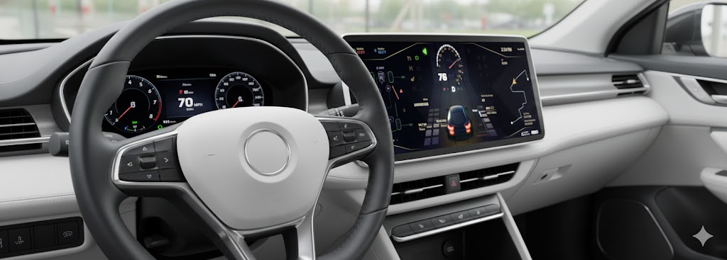
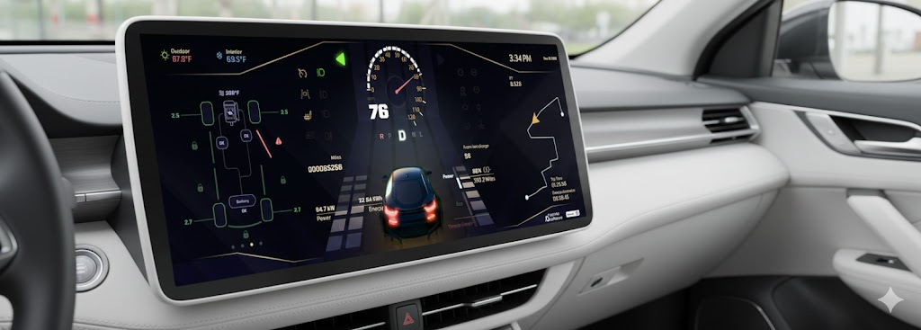
This UX project focuses on providing real-time vehicle diagnostics, navigation, and energy management through a centralized 1920x720 panoramic display. The interface is designed for high legibility at high speeds while maintaining a premium, tech-forward feel. The challenge was to design a product that transforms complex data into clear insights while ensuring a seamless, intuitive experience for non-technical users.
Industry
Automotive
Qt Technology
Tools
Figma
Jira
Adobe Illustrator
Key Functional Areas
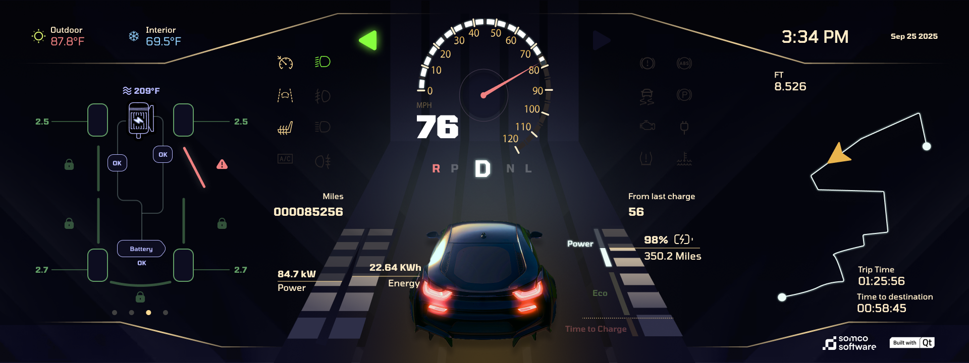
Primary Driving Data (Center): * Large digital speedometer (76 MPH) paired with a traditional radial gauge.
Gear selection indicator (D emphasized) and a 3D rear-view perspective of the vehicle.
Vehicle Health & Safety (Left): * Real-time tire pressure monitoring (ranging from 2.5 to 2.7 bar).
Drivetrain status showing motor and battery temperatures (209°F).
Active safety alerts (e.g., the red exclamation mark on the front-right wheel).
Energy & Range Management (Bottom Center/Right): * Live energy consumption (22.64 kWh) and power output (84.7 kW).
Battery state of charge (98%) with an estimated range of 350.2 Miles.
Navigation & Trip Logistics (Right): * Abstracted path-finding map with waypoint markers.
Dynamic trip data: Elapsed time vs. time to destination.
UX Observations
The layout utilizes a triadic structure:
Maintenance/Status on the left.
Immediate Action (Speed/Gear) in the center.
Contextual Info (Navigation/Time) on the right.
This minimizes cognitive load by grouping related information where the driver expects to find it. The use of 3D rendering for the vehicle provides a spatial reference for alerts, making it easier to identify which specific part of the car requires attention.
UX Priorities
Spatial Mental Mapping
The interface uses a 3D Digital Twin of the car at the bottom center.
The Benefit: Instead of reading a text alert like „Front Right Tire Pressure Low,” the driver sees a red hazard line and exclamation mark physically located on the right side of the vehicle graphic.
Result: This reduces the cognitive translation time from „reading” to „acting.”
High-Contrast "Dark Mode" Aesthetic
The UI utilizes a deep charcoal/black background with high-saturation accent colors.
Safety: This minimizes light pollution inside the cabin during night driving, preventing pupil dilation issues and windshield glare.
OLED Optimization: If used on an OLED screen, the true blacks save power and make the „Cyber Lime” and „Electric Blue” indicators pop with extreme clarity.
Information Layering & Priority
The layout follows a strict hierarchy based on the urgency of the data:
Tier 1 (Focus): Speed and Gear (Center) are the largest elements, utilizing high-contrast white text against the dark void.
Tier 2 (Navigation/Range): Located on the right, providing the „What’s next?” context.
Tier 3 (Status): The left and top margins house secondary data like temperature (87.8°F), odometer, and climate settings.
Skeuomorphic & Digital Hybrid
While the interface is modern, it retains a Radial Speedometer arc.
Why it works: Drivers are trained to recognize the angle of a needle even without reading the numbers. This hybrid approach offers the precision of a digital readout (76 MPH) with the intuitive feel of an analog gauge.
1. The "Vehicle-as-Canvas" Solution
Instead of a list of data points, the UX uses the vehicle’s silhouette as the primary navigation tool for status updates.
The Problem: Traditional dashboards require the driver to interpret icons (e.g., a „tire” symbol) and then remember which tire it refers to.
The Solution: A top-down wireframe on the left and a 3D rear-view in the center. Alerts are anchored to the specific geometry of the car. When a tire is low or a motor is hot, the light appears on that part of the graphic, removing the middle step of mental translation.
2. Cognitive Load Reduction via „Silent” States
The UI employs a conditional visibility strategy for its iconography.
The Problem: Overwhelming the driver with 20+ icons (ABS, Engine, Oil, High Beams) creates „visual noise.”
The Solution: Inactive systems (like the engine check, parking brake, and light icons) are rendered in a low-opacity „ghost” state. They only „wake up” and change color when they require the driver’s attention or are actively engaged. This keeps the driver’s focus on the 76 MPH speed and the navigation path.
3. Energy Literacy & Range Anxiety Mitigation
For EV drivers, understanding power flow is more critical than knowing RPM.
The Problem: Energy consumption can be abstract and stressful.
The Solution: The UX provides a dual-metric energy readout.
The Quantitative: Exact percentages (98%) and miles (350.2).
The Qualitative: A „Power vs. Eco” bar. This gives the driver an immediate „vibe check” on their driving efficiency without needing to calculate kWh math while steering.
4. High-Speed Legibility (Glanceability)
The layout is optimized for the „2-Second Rule” (the maximum time a driver should look away from the road).
The Solution:
Typography: Large, high-weight numerals for speed.
Symmetry: Balanced layout with the most vital „active” info (Speed/Gear) in the „Dead Zone” (the area visible through the top half of the steering wheel).
Color Coding: Green = Good/Active, White = Neutral, Red = Immediate Hazard.
Safety-Critical Testing (Compliance)
Because the instrument cluster is an ASIL (Automotive Safety Integrity Level) relevant component, testing must go beyond „looks” to focus on functional safety.
Glance Duration Testing: Using eye-tracking hardware to ensure drivers can retrieve the speed (76 MPH) or range (350.2 mi) in under 500 ms.
Latency Benchmarking: Ensuring „Start-to-Display” (boot time) and „Signal-to-Graphic” latency (e.g., the needle moving when you accelerate) is nearly instantaneous. High latency in a speedometer can lead to driver disorientation.
Tell-Tale Validation: Rigorous testing of the status icons (ABS, Battery, Temperature) to ensure they illuminate correctly under failure conditions defined by ISO 26262 standards.
Dynamic Optimization
Optimization is the process of refining the UI based on real-world environmental factors.
Luminance & Auto-Dimming: Testing the „Cyber Lime” and „Electric Blue” accents against varying ambient light. The UI must be legible in direct sunlight (high-noon glare) and non-blinding in pitch-black tunnels.
Color-Blindness Accessibility: Validating that the red safety alert on the tire pressure (2.5) is distinguishable from the green „Eco” bar for users with protanopia or deuteranopia (often by using shape + color).
Thermal Performance: Since the cluster is built with Qt, optimization focuses on reducing CPU/GPU load to prevent the hardware from overheating during long trips, which could cause frame-rate drops.