UX/UI Project - Medical Device for dermathology treatment
Project Overview
This case study examines the development of a guided user interface (UI) f a sophisticated fractional radiofrequency (RF) and laser dermatology device. The project focused on transforming complex clinical parameters into a seamless, intuitive digital workflow for practitioners. The challenge was to design a product that transforms complex data into clear insights while ensuring a seamless, intuitive experience for non-technical users.
Industry
Medical
Qt Technology
Tools
Figma
Jira
Adobe Illustrator
Target
The primary goal of the interface design is to empower Dermatologists, Plastic Surgeons, and Aesthetic Nurses to perform complex treatments with higher confidence and less manual calculation.
The User Target: Medical Practitioners
The primary goal of the interface design is to empower Dermatologists, Plastic Surgeons, and Aesthetic Nurses to perform complex treatments with higher confidence and less manual calculation.
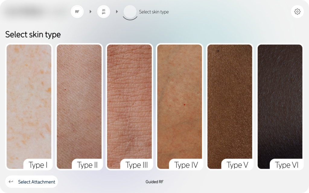
Safety & Accuracy: By using a „Guided Mode,” the project targets the reduction of human error. The system forces a check of the skin type (Fitzpatrick scale) and tip density before allowing energy delivery.
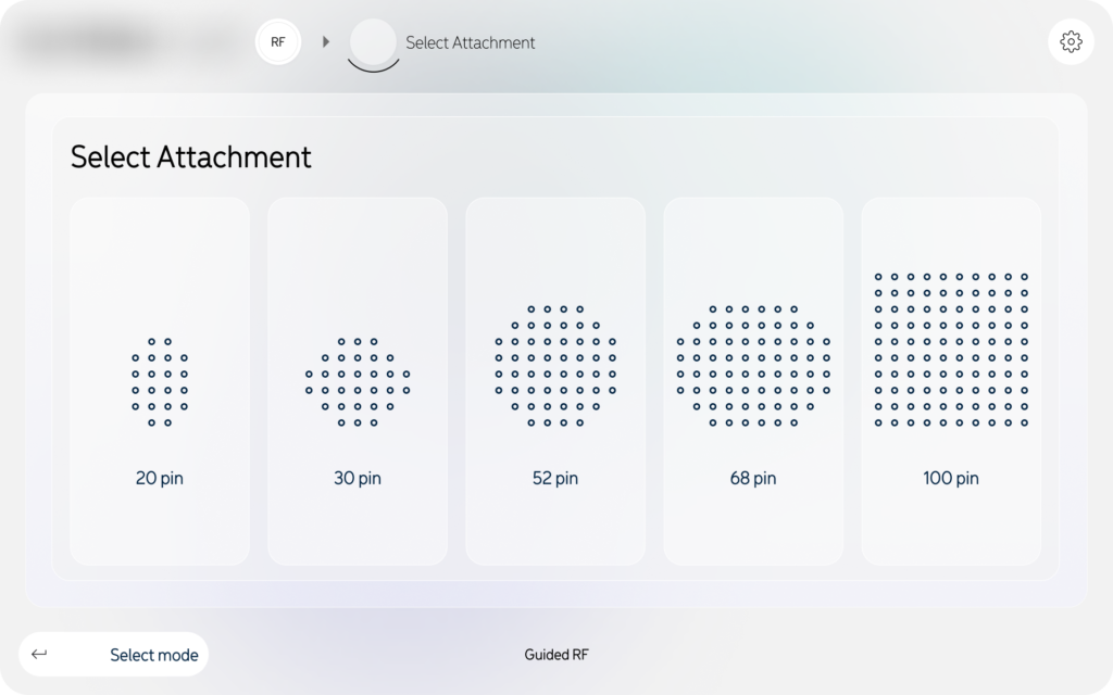
Workflow Efficiency: The step-by-step wizard (App Select → Confirm Attachments → Select Skin Type) is designed to minimize setup time in a busy clinical environment.
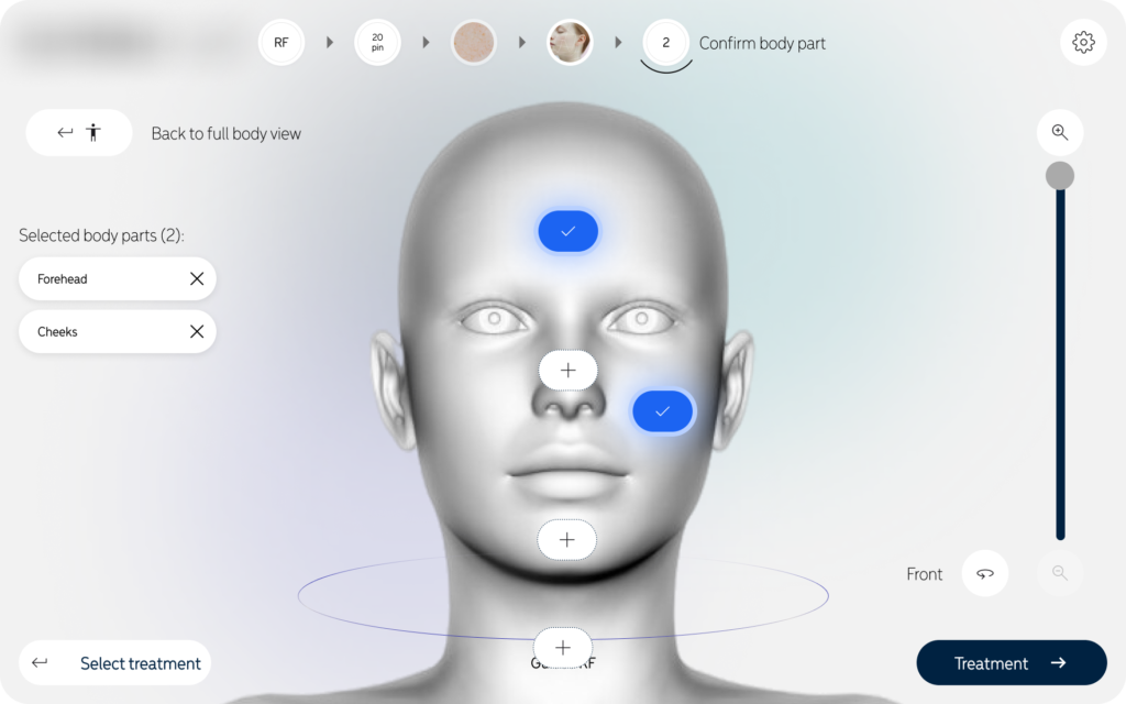
Precision: The 3D anatomical mapping allows practitioners to pinpoint exact treatment zones, ensuring consistent results across multiple sessions.
2. The Clinical Target: Patient Indications
The device itself targets specific skin conditions through a combination of Radiofrequency (RF) Microneedling and Laser resurfacing. The project aims to treat:
Anti-Aging: Reducing fine lines, deep wrinkles, and „crepey” skin.
Textural Issues: Minimizing large pores, acne scars, and surgical scarring.
Skin Quality: Improving sun damage, stretch marks, and overall skin tone.
Inclusivity: Because of the „Skin Type” selection step, the project specifically targets all Fitzpatrick skin types (I–VI), making high-end resurfacing safe for darker skin tones that were previously at risk with older laser technologies.
3. The Business Target: Brand Positioning
The target of this UI project is to position the FraxRF as the most „intelligent” and „user-friendly” device on the market. By moving away from a screen full of confusing numbers and toward a visual, guided experience, they make their high-tech hardware more accessible to a broader range of clinical staff.
Clinical & Safety Risks (High Stakes)
Risk of Thermal Injury: Improper energy settings can lead to burns, scarring, or permanent skin damage. The UI must prevent users from entering dangerous parameters.
Pigmentation Complications: Patients with darker skin (Fitzpatrick IV–VI) are at high risk for PIH (Post-Inflammatory Hyperpigmentation). A major problem is ensuring the practitioner doesn’t skip the „Select Skin Type” step.
Hardware-Software Mismatch: If a user attaches a 100-pin tip but the software thinks it is a 20-pin tip, the energy density will be dangerously incorrect.
User Experience & Workflow Challenges
Cognitive Overload: Practitioners often work in fast-paced, high-stress environments. A screen filled with complex numbers (mJ, Hz, pulse width) can lead to „analysis paralysis” or entry errors.
Sterility & Interaction: Doctors often wear gloves or use protective coverings on screens. Buttons that are too small or menus that require deep „drilling” are difficult to use mid-treatment.
Training Gaps: Clinics often have staff with varying levels of experience. The device must be intuitive enough for a new nurse while remaining efficient for an expert dermatologist.
nterface Design Obstacles
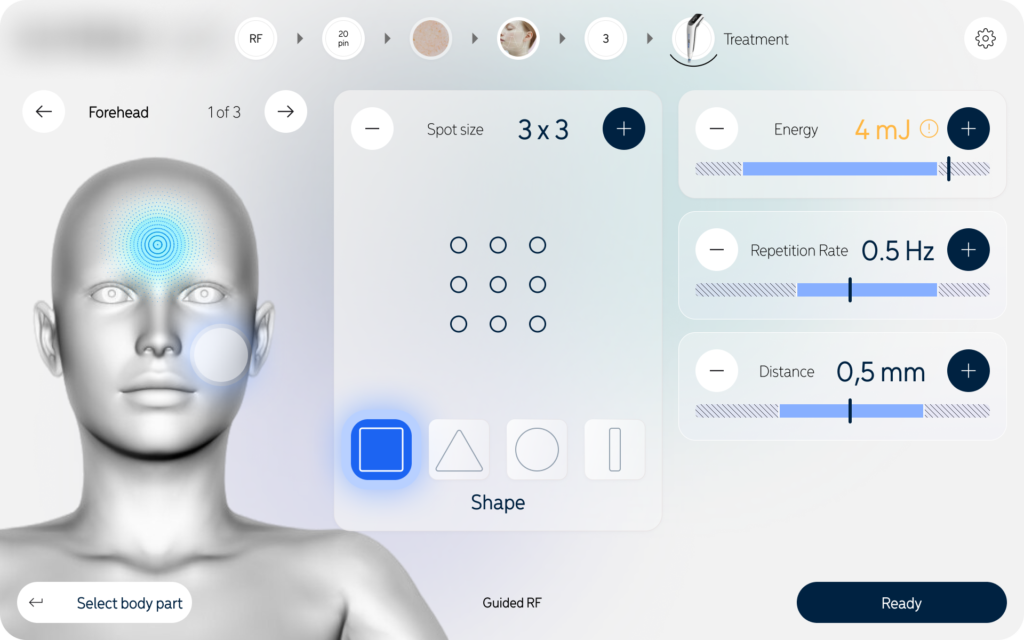
Anatomical Accuracy: Traditional „flat” body maps are often too vague. A major challenge is providing a detailed 3D mapping system that allows the user to differentiate between sensitive areas (like the periorbital/eye area) and tougher skin (like the cheeks).
Visibility in Clinic Lighting: Medical offices often have very bright surgical lights or very dim „spa” lighting. The UI must maintain high contrast and readability in both extremes.
System Latency: In medical procedures, „lag” is a safety issue. If the „Preparing Device” screen takes too long or doesn’t provide real-time feedback, the practitioner may assume the device is frozen.
Key Design Features
Minimalist Aesthetic:
High-contrast, clean backgrounds with soft gradients to maintain a "medical-grade" professional feel.
Visual Consistency
Use of 3D modeling and high-resolution skin photography to provide realistic context for the practitioner.
Dynamic Breadcrumbs:
A top-level progress bar that allows users to see exactly where they are in the setup and jump back to previous steps if needed.
The Solution: A Step-by-Step Guided Workflow
The interface utilizes a linear, wizard-style navigation that leads the user through the setup process:
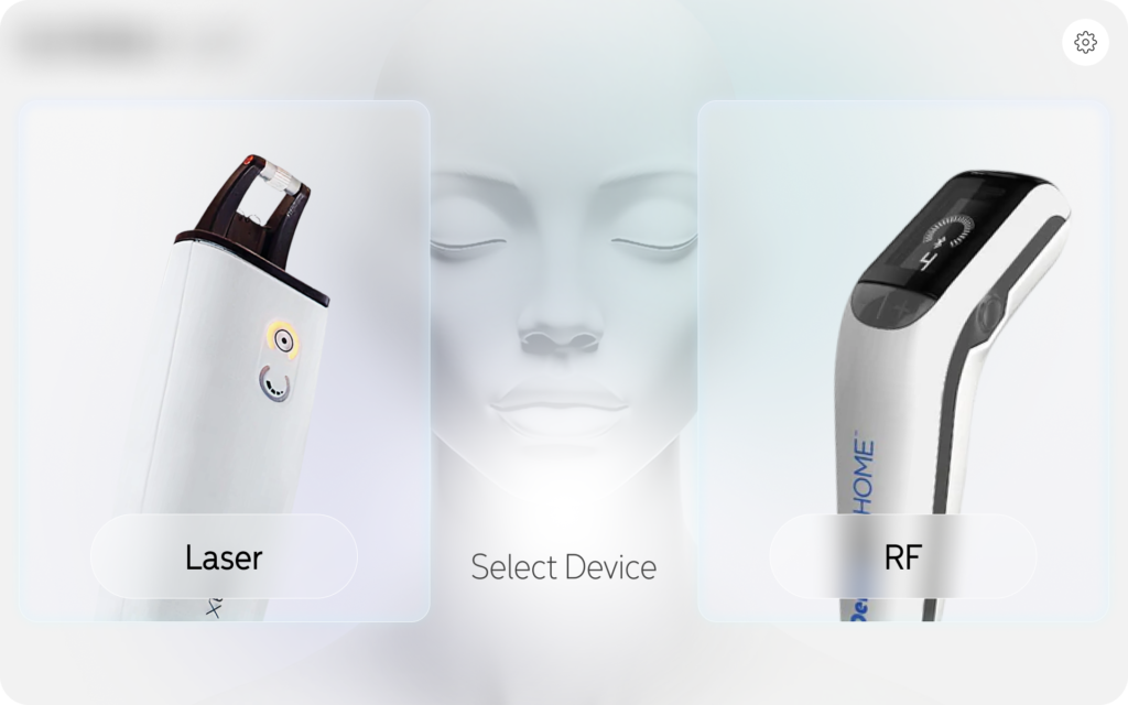
Device Selection: A clean entry point allowing users to choose between Laser and RF modalities.
Hardware Configuration: Visual selection of anatomical attachments (20-pin to 100-pin) to ensure the physical tip matches the software’s energy calculations.
Clinical Diagnostics: Integration of a visual Fitzpatrick Skin Type selector (Type I–VI) to automatically calibrate safe energy thresholds.
Precision Targeting: A 3D anatomical mapping system where users can select specific zones (forehead, cheeks, chin) with zoom-in capabilities for high-detail areas.
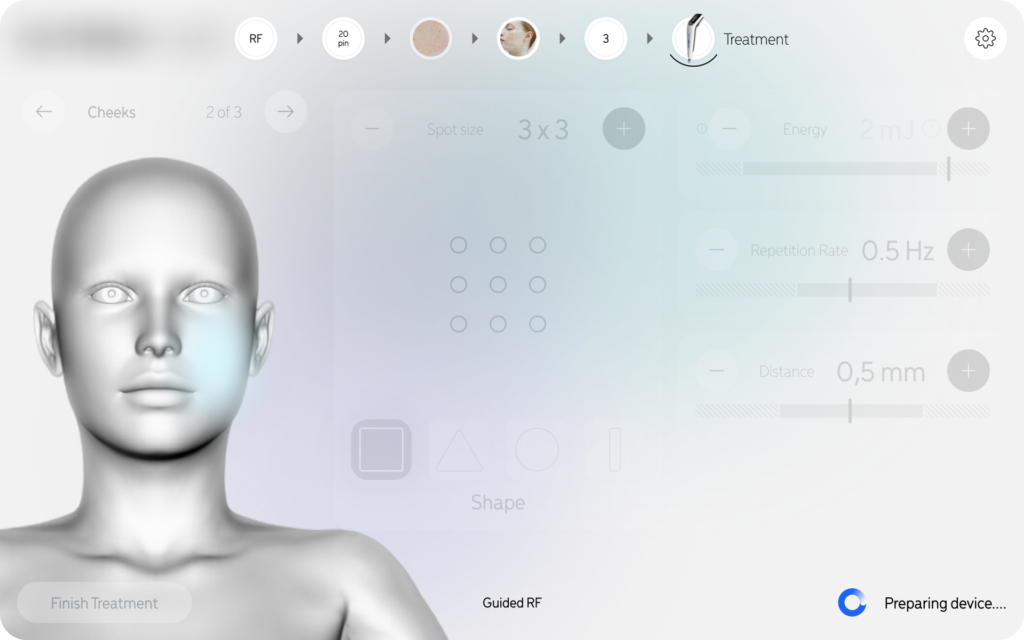
Real-time Readying: A „Preparing Device” phase that provides clear feedback on system status, energy levels (mJ), and repetition rates (Hz) before the treatment begins.
Design and UX – A project created with intuitiveness and efficiency in mind
To create a compelling case study for a medical device like this, your design principles should emphasize the balance between clinical safety and user-centricity.
Here are the key design principles used in this project:
1. Safety-First Guided Workflow (The „Guardrail” Principle)
The UI doesn’t just offer options; it leads the user through a mandatory sequence.
Application: By forcing the „Confirm Attachments” and „Select Skin Type” steps before the „Ready” state, the design prevents accidental firing with incorrect settings.
Goal: To eliminate human error in high-stakes medical procedures.
2. Cognitive Load Reduction
Dermatologists focus on the patient’s skin, not a computer screen. The interface uses „progressive disclosure” to show only what is necessary at each stage.
Application: Using large, clear icons for tip density (20 vs 100 pins) and a simple 1–6 scale for skin types rather than dense data tables.
Goal: To allow the practitioner to make fast, confident decisions without feeling overwhelmed by technical data.
3. High-Fidelity Visual Mapping
Abstract text descriptions are replaced with realistic anatomical representations.
Application: The „Zoomed Body Part” feature provides a 3D-style visual of the face. This ensures the energy delivered is appropriate for the specific skin thickness of that zone (e.g., thinner skin on the forehead vs. thicker skin on the cheeks).
Goal: To bridge the gap between the digital interface and the physical patient.
4. Direct Feedback & System Transparency
In medical tech, „silence” from the machine causes anxiety. The interface provides constant status updates.
Application: The „Preparing Device” screen uses a clear loading state, specifically displaying the calculated parameters (mJ and Hz) so the user can verify them one last time while the hardware calibrates.
Goal: To build trust between the practitioner and the technology.
5. Medical-Grade Aesthetics (Clean & Clinical)
The visual style uses a „Light Mode” with high-contrast elements and professional photography.
Application: A neutral color palette (whites, greys, and blues) that mimics a sterile clinical environment, with high-quality imagery of skin types to assist in accurate diagnosis.
Goal: To reinforce the device’s identity as a premium, scientific tool rather than a consumer gadget.
6. Tactile Accessibility
Recognizing that users are often wearing medical gloves and standing at an angle to the machine.
Application: Large „Hit Areas” for buttons and a vertical navigation flow that is easy to tap even when the user’s range of motion is limited by the procedure.
Goal: To ensure the interface remains functional in a physical, „hands-on” medical setting.
Testing and optimization
1. Formative Evaluation (Iterative Design)
The goal of this phase was to identify usability flaws early, before the software was fully built.
Methodology: 1-on-1 interviews and „Think-Aloud” protocols with 5–8 dermatologists and aesthetic nurses.
Key Insight & Optimization:
The Issue: Early testers found the body mapping icons too small to tap accurately with surgical gloves.
Optimization: Increased „hit areas” for anatomical zones and added a zoom-in feature (as seen in your Zoomed body part screen) to ensure precision.
The Issue: Users were unsure if the device was actually „calibrating” or just „loading.”
Optimization: Added the „Preparing device” screen with real-time parameter feedback (mJ, Hz) to provide system transparency.
2. Summative Validation (Regulatory Testing)
This is the final, high-stakes test to prove the device is safe for the market.
Simulated Use Testing: Conducted in a mock clinical environment with at least 15 participants per user group (Doctors vs. Nurses).
Task Success Metrics: * Critical Task: Selecting the correct skin type and attachment tip.
Success Criteria: 100% completion rate with zero „use errors” that could lead to patient harm (e.g., setting the energy too high for Fitzpatrick Type VI skin).
Knowledge Assessment: Testing if the user understands the visual cues. For example, verifying that practitioners correctly interpret the skin type icons without needing to consult a manual.
3. Usability Metrics Tracked
To give your case study „teeth,” mention these specific metrics:
| Metric | Goal | Result (Example) |
| Task Time | < 45 seconds for setup | 32 seconds (Average) |
| Error Rate | 0 Critical Use Errors | 0 Errors (Achieved) |
| SUS Score | System Usability Scale > 80 | 92/100 |
| Cognitive Load | Low (Self-reported) | Practitioners felt „confident” and „guided” |
4. Continuous Optimization (Post-Market)
Testing doesn’t end at launch. The project includes a plan for:
A/B Testing UI Updates: Testing if changing the color of the „Ready” state affects reaction time.
Error Log Analysis: Monitoring „close calls” in real-world usage to refine future software patches.